Talk to Me In Korean
How my experimental app design for a popular Korean language-learning website went on to impact their business model.
NOTE: This is a personal project, and was done entirely for research purposes. I am not affiliated with the Talk To Me In Korean website or the creators.
Duration
January to April 2023 (4 months)
Platform
Mobile App
My Role
Researcher, UX Designer, Prototyping & Usability Testing
About “Talk To Me In Korean”
Talk to Me in Korean (TTMIK, for short) is a website that provides Korean language lessons for English speakers. It is created by native Korean speakers, who not only teach Korean grammar and vocabulary, but also how to sound natural and conversational when speaking.
“It focuses on doing one language well rather than multiple languages moderately well. And Talk To Me In Korean does this very well.” ~Actual Fluency
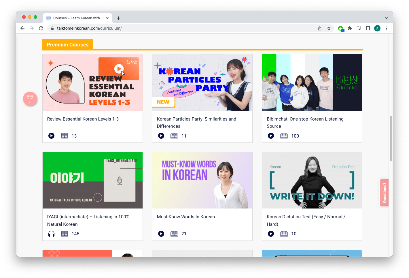
The Problem: Many learners never get around to the paid content
TTMIK has over 300 pages of free content, ranging from beginner to advanced levels. Unfortunately, that also means that there’s not enough incentive for learners to pay for premium content.
“$17 a month is a little too much for me, considering how much you can get [for free]. Also, I’m very hesitant to purchase anything that I’m not sure I’m going to follow through on.” ~TTMIK user, moderated interview
Pictured below is the rapid drop in user engagement as the free lessons progress.

This poses a business problem for TTMIK, but it also means that many learners are not getting the most they could out of the website.
Assessing Learner Types
TTMIK’s users, referred to as “learners” on the website, mainly consist of:
People who want to learn to speak Korean.
People who know basic Korean, but want to sound more natural when they speak.
People who want to expand their Korean vocabulary.

The UI above, referred to on the site as a “course matrix”, provided useful insights into the types of users who frequently visit the site, as well as their specific learning goals.
Design Opportunities
How might we convey to non-paying visitors that a premium subscription will get them to their goal faster and more effectively?
How might we adapt this website into a mobile app in a way that increases overall user engagement?
The Missing Mobile App
I chose to present all of my designs in a mobile app format since TTMIK currently doesn’t have an official app for their online lessons. With mobile apps driving 157% higher conversion rates than mobile websites, this felt like a missed opportunity to boost user engagement—especially for a learning platform where consistency is key. I was also interested in exploring how the website’s experience could translate into a dedicated app.
Research Methods
I did most of my research through reading online reviews in the form of blogs and chat forums. Then, to corroborate what I found and to pick up any additional insight, I interviewed two people who have used the website and recently abandoned it.
Secondary Research Methods:
Online forums, blogs, and reviews of TTMIK
Competitive analysis with other language apps
Primary Research Methods:
Moderated interviews with 2 TTMIK users
Usability test of the original TTMIK website
Design Challenge #1: Maximizing Clickability
Paying members have access to a wide variety of premium courses with different focuses and teaching methods. They are meant to supplement the free courses, so that learners can try various learning methods.
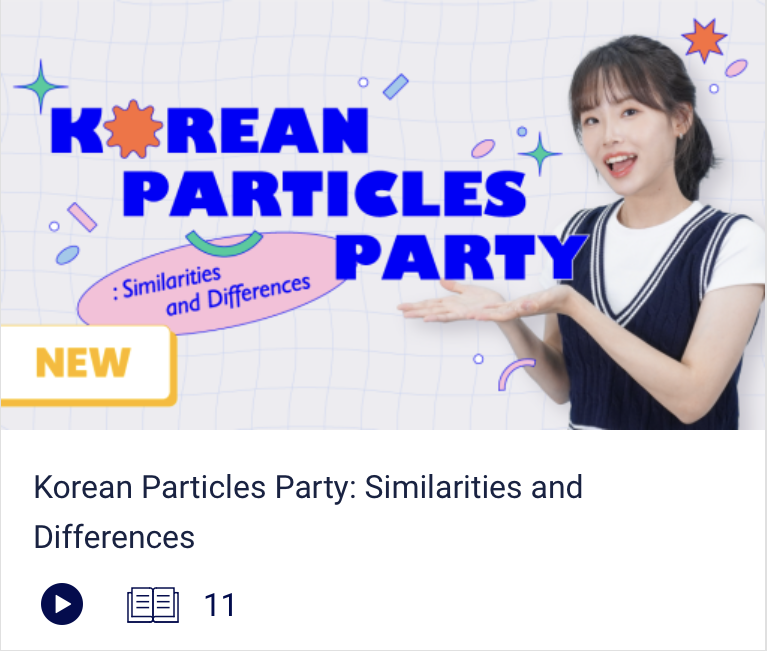
However, during testing, I learned that there is confusion about what the premium courses are, and worse, people are not curious enough to even click on them - not even if they thought they were free!
I performed a simple usability test to gauge TTMIK users’ general perception of this UI, and discovered that not enough users were clicking on these premium course cards, even though they visited the site many times before.
While exploring the reasons behind this lack of curiosity, I noticed two things:
Learners were not interested in exploring these courses because they had so many free courses that they haven’t made use of. They saw the premium courses as something to be used in the future.
Even for those who thought that the courses were free, learners mistakenly thought the course cards were links to Youtube videos.
As I went into the redesign process, I explored ways to alter the course card layouts to make them more informative and clickable.

An analysis of the current course card design (left), plus explorations of design alternatives (right).

Course card design sketches, continued (click for closeup).
This involved refining visual hierarchy, adjusting button sizes, and incorporating clearer affordances to guide interactions seamlessly.

Hi-fi course card design iteration with notes (click for closeup).
Original
Usability test participants had mistaken the original course card as a Youtube link.
My Design

My redesign, featuring:
A square-shaped thumbnail to distinguish from Youtube thumbnails
Eye-catching iconography that signifies the target level / length of the lesson
A short description of the course
A clear call-to-action button.
Design Challenge #2: Inspiring Curiosity
In addition to the free lessons available to everybody, paying members also get a chance to review each lesson; with a sample dialogue video and a 10-question review quiz. However, other than the title tabs, those were the only clues to the premium content that free users were going to get.
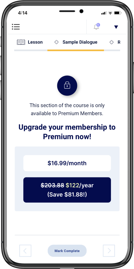
Original design shows paywall when trying to access premium content, and not much else.
Designing a Sample Dialogue Teaser
My problem with the original paywall layout is that it doesn’t invite enough curiosity. So my solution was to add teasers. For the sample dialogue, I decided to show a 3-5 second preview of the video, ending with a prompt to upgrade.

Designing teasers that reveal just enough of the premium content to get free users interested.
Original
Original just shows the plan prices.
My Design

My version shows a 3-5 second preview of the sample dialogue video, and what to expect when they upgrade.
Designing a Review Quiz Teaser
And for the review quiz, I displayed a locked preview of the first question.

Exploring ways to show the free user what kind of review questions to expect upon upgrading.
Original

Original just shows the plan prices.
My Design

User can read the first few review questions, but will need to upgrade to interact with them.
Design Challenge #3: Boosting Motivation
“My Learning Center” is a page where a learner can track their progress on the site. I redesigned the content to add more incentives for the learner to have longer term engagement with the website/app. Using feedback from the first usability test and design inspiration from competing language apps, I applied these changes:
Achievement badges
Achievement badges are something I see in many apps that involve goals and accomplishments, and they’re effective motivators.
Original
My Design

Achievement badges give learners smaller, more achievable goals throughout their journey.
Progress markers
The original design has its own version of progress markers, but in my version, I made them pop more. I also added an overall progress summary.
Original

My Design
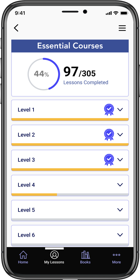
Progress markers are more clearly defined in the newer version.
Usability Testing: Final Comparisons
I tested my final prototype on an online user testing platform, all unmoderated. There were 5 participants. I conducted the tests, then compared the results to the first usability test, where I had participants test the original website on mobile. The final prototype tested very well in comparison.
5 out of 5 were able to accurately describe the format of the premium courses, compared to 1 out of 4 from the first round.
4 out of 5 said they would be willing to upgrade (one was on the fence), compared to the initial 1 out of 4.
5 out of 5 said that they were satisfied by the way the premium content was presented, compared to the initial 1 out of 5.
Finally, when I asked each participant to choose between upgrading to premium or finding other study methods, one participant said:
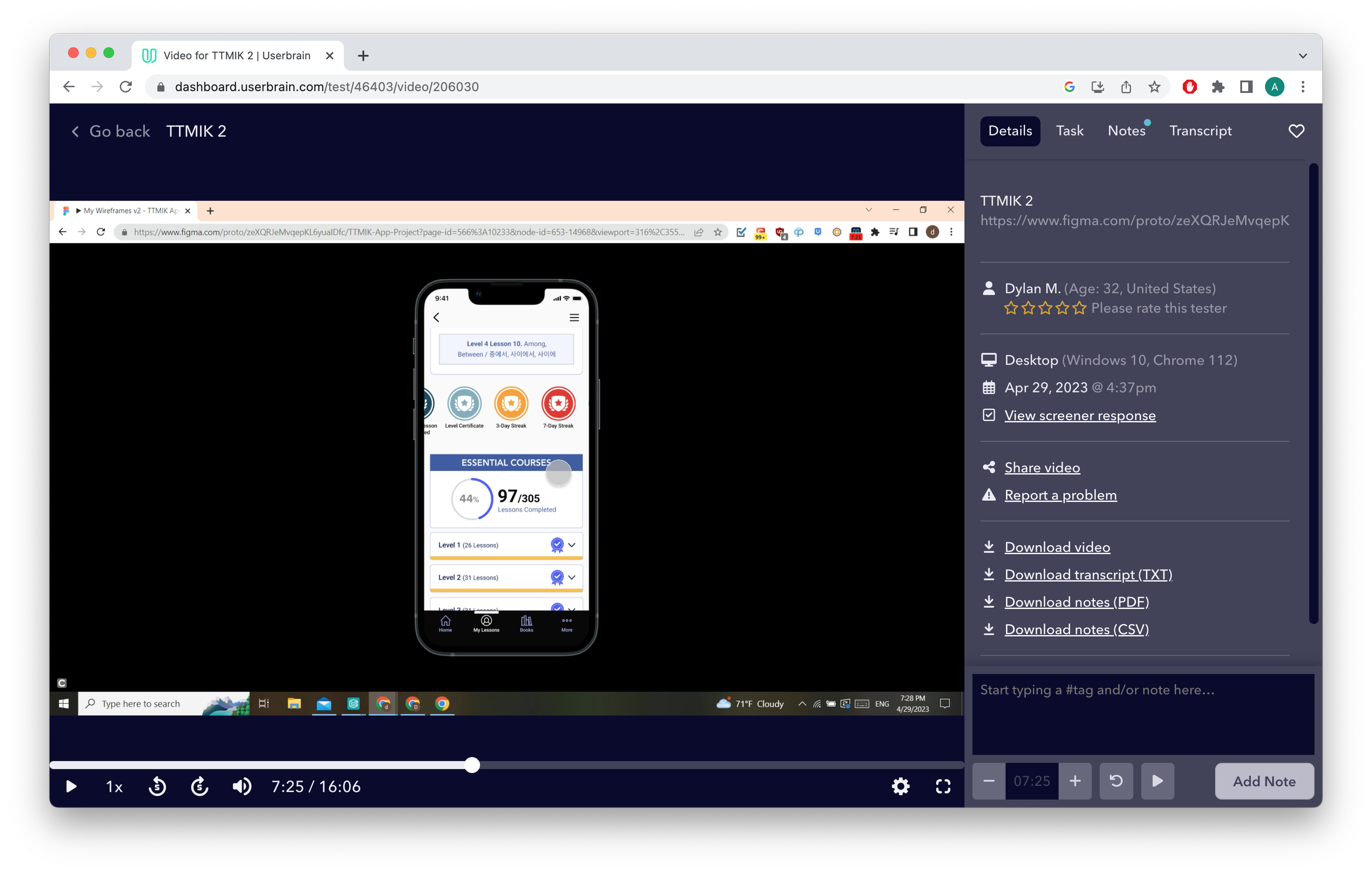
“Definitely, I would upgrade. I think the free content is solid, but if you’re really serious about learning a language, then I think paying for the premium tier is a no-brainer.” ~Dylan M.
When TTMIK Reached Out to Me
In an unexpected turn, my case study became the catalyst for a redesign of the official TTMIK website. Shortly after I published this case study, the TTMIK team reached out to commend my research and design work. They also invited me to participate in a user study as part of a new phase they were launching, which I was glad to join.

Later, TTMIK transitioned to a fully paid platform. Given the thoughtfulness and effort they consistently put into their content, I believe this was a fair and sustainable way for them to be compensated for their work.