
OSL Serves
How I redesigned a website for a Seattle nonprofit organization that serves free meals to local people in need.
Duration
June to September 2022 (10 weeks)
Platform
Desktop / Mobile
My Role
Lead in information architecture, prototyping and usability testing
The Designers
For this project, I teamed up with three other designers. The four of us collaborated on every stage of the process, but each of us also had our own roles as leaders. I was the lead in information architecture, and prototyping/usability testing.
The Client: Only Serving Love (OSL)
The client is a Seattle-based nonprofit organization called Only Serving Love (www.oslserves.org). Each year, they rescue roughly a million pounds of food from going to waste, and with it, they serve free, healthy meals onsite to Seattle’s food-insecure population.
The Problem: More Donations Needed
OSL needs more donations. They also need help recruiting new employees, such as drivers and chefs.
Target Audience
We identified the following user types as:
Donors
Potential employees
Volunteers
People looking for meal service
Telling the OSL Story
OSL believes that the best way to attract more donors is to tell the OSL story through their website in the most effective way possible.
“The goals of the website are to tell the OSL story in a rich, compelling manner. The outcome for a user should be ‘I get what OSL does and stands for and this is an amazing organization.’” ~Chris, OSL Representative
What I Did
I took the lead in information architecture and prototyping/usability testing, but I was also very involved in wireframing and content design. Here are the parts of the website where I made the most impactful decisions.
The Homepage: A Lesson on Balance
Some of the problems that we identified upon examining the homepage were:
Header takes up too much space
Very little context and information above the fold
Poor information hierarchy; the page starts off with what reads as a blog post, while the information more relevant to the visitor is much further down


A lackluster overcorrection
The first thing we did was to get rid of the blog post, and move all the important information to the top. However, I noticed that our minimalist approach had stripped away all the heart and passion that was apparent in the original.

Reintroducing the story
In order to bring the page back to life, I made the decision to add a “stories” section at the bottom, featuring snapshots of the work that OSL does with brief summaries; each linking to a blog post. I then redesigned the mission statement by adding iconography and pops of color, for more impact.


Volunteer: A Lesson on User Journeys
The original volunteer page was also very text-heavy, so we thought the information was best presented if split into multiple pages.

Organizing by visitor type
When thinking about the best way to achieve this, I made the call to organize it based on the most likely visitor types:
People who are simply browsing (General Information page)
People who are interested in volunteering, but want more information (FAQ page)
Committed volunteers looking for next steps (Hours & Requirements page)

General Information

FAQ

Hours & Requirements
The volunteer chart
Under Hours & Requirements, I adapted the volunteer schedule into a chart, for better scannability.

BEFORE

AFTER
These changes resulted in a smooth user journey that passed the usability test with flying colors.
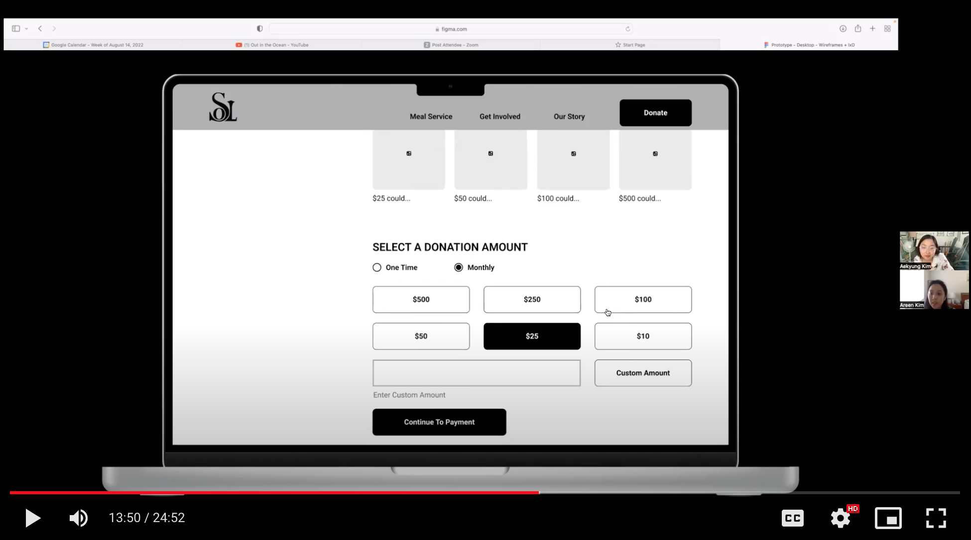
Donate: A Lesson on Simplicity
The original donation page also led with a lot of text, followed by a one-time donation button that is small and quite missable. Meanwhile, it looks like they used a subscription service template for the monthly donations. I found the layout to be uncharacteristic of a nonprofit and feared it would change the way a donor sees the action.


Sticking to convention
I replaced the original layout with something more conventional, adding a text field for custom amounts and an option to make it a one-time or a monthly donation.
BEFORE

AFTER
Final Design
Research shows that it is crucial for a donor to know exactly where their money is going. The final layout includes a section that gives people an idea of what their amount can do, plus an impact section that summarizes what OSL was able to accomplish with donations in the past year.


Usability Testing: An Overall Success
As the team leader in prototyping and usability testing, it was my responsibility to iterate on and finalize the prototypes so that everything operated smoothly. I then designed a research plan with 6 tasks, keeping the following user types in mind: donors, volunteers, and meal recipients.
The team tested a total of 10 participants, asking them to perform the tasks on a desktop computer and then rate the difficulty of each task on a scale of 1 (easiest) to 5 (most difficult).
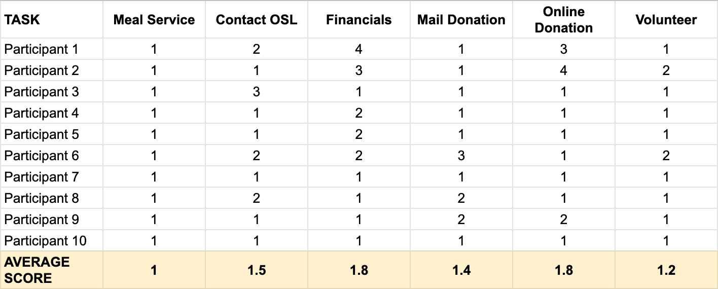
The overall results of the tests were positive. People had no trouble navigating the website to find the information they needed. They were also able to perform each of the assigned tasks with little to no difficulty.
Outcome: Presenting to the Client
The team was asked to present in front of OSL representative Chris Copacino and the OSL founder and project client, Beverly Graham. Both of them were pleased with the results. Beverley even wanted to know if we would be willing to help apply the changes to the actual website.

Reflection: Dealing With Obstacles
During this project, I learned how to deal with certain roadblocks such as limited time and resources.
For example, planning within the capabilities of Squarespace was a new experience for me. I learned to be more mindful about the scope and constraints of a project. Sometimes my ambitions can get away from me, in which case, I need to reel them in and set realistic goals.

Time was also a constraint. So I learned to plan for the best and worst case scenario and adapt accordingly. This ended up applying to both the design and research process.
