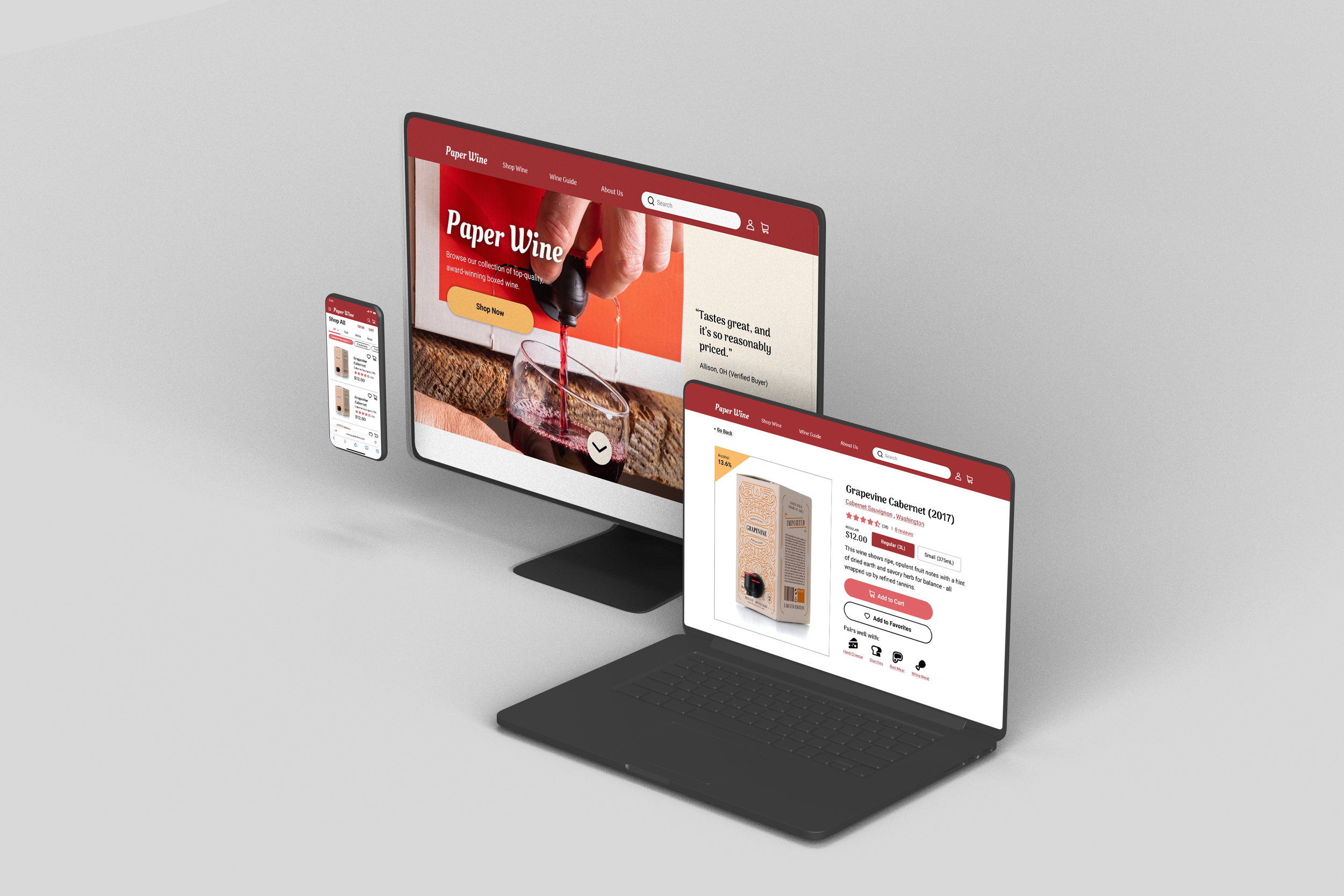
Paper Wine
How I conceptualized an e-commerce website that sells boxed wine.
Duration
November 2021 to May 2022 (6 months)
Platform
Desktop / Mobile
My Role
Researcher, UX Designer, Prototyping & Usability Testing
About Paper Wine
“Paper Wine” is my proposed solution to popularizing boxed wine among a certain demographic, with the goal of combatting the general stigma caused by outdated preconceptions.
Since this was an individual project, I took on every role from conception to the finished prototype.
The Problem: Making the Switch
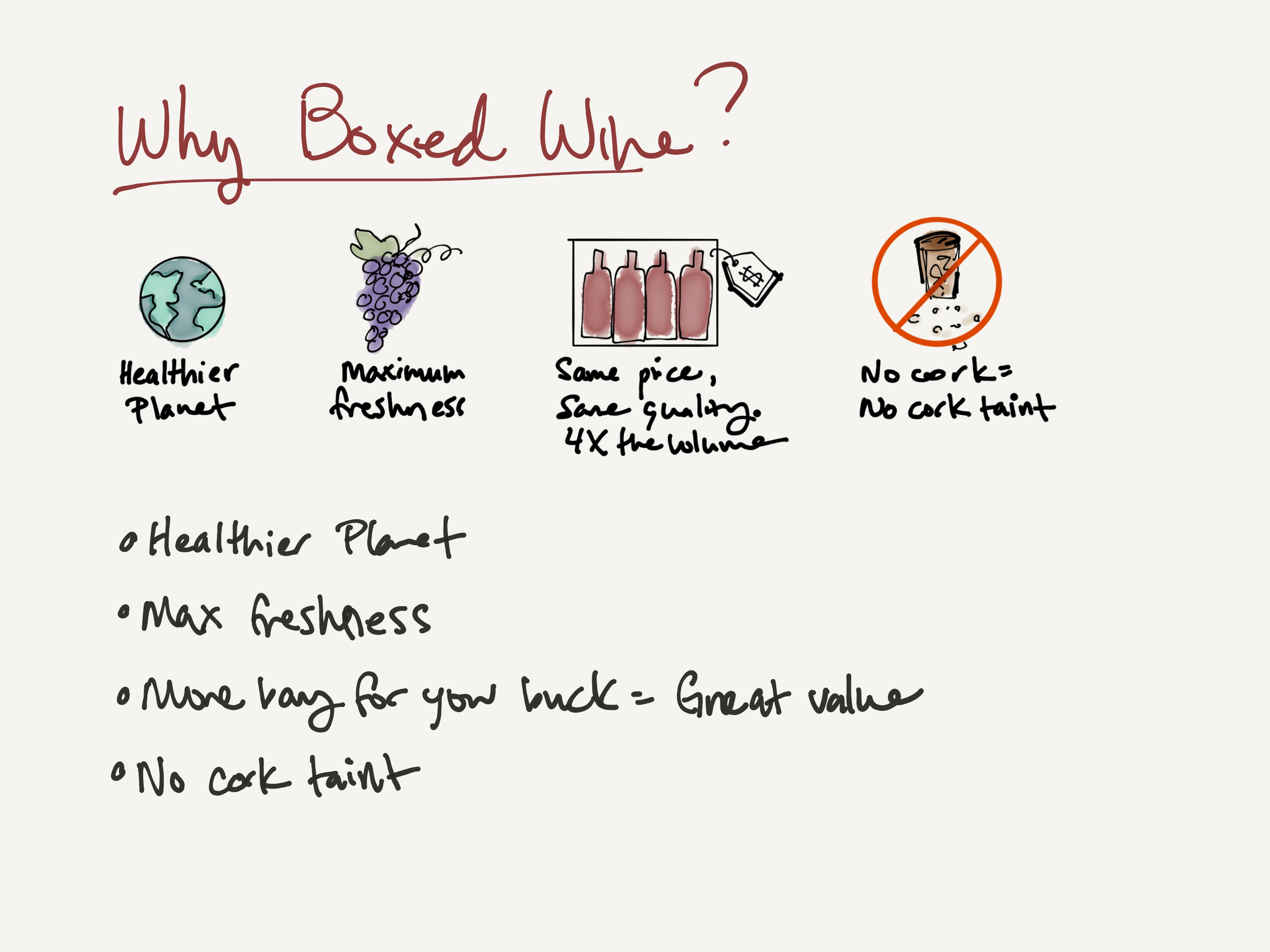
Boxed wine has several advantages over bottled wine: value, freshness, and eco-friendliness. But boxed wine has also been given a bad rap, thanks to some earlier low-quality brands. As a result, most wine-drinkers of a certain age are hesitant to make the switch from bottled wine to boxed.
Research: Who Buys Boxed Wine?
Boxed wine is more often the item of choice among wine-drinkers in their early twenties, or Gen-Zers. With that said, not enough of the Gen-Z population have reached the drinking age to make a significant dent in the overall market.
Research: Why Aren’t Millennials Buying Boxed Wine?
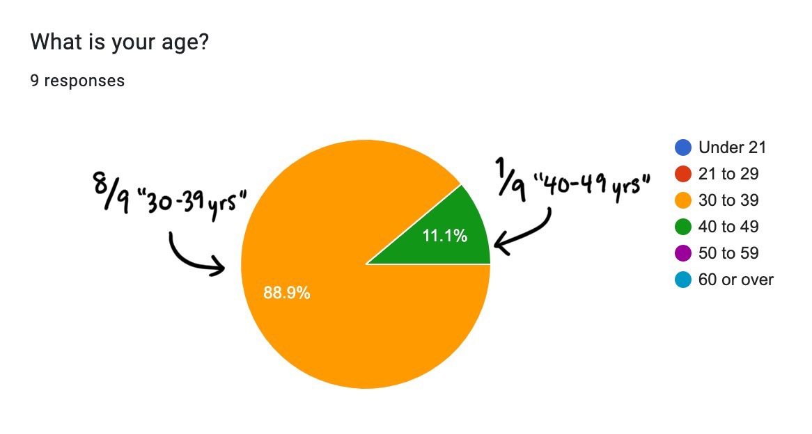
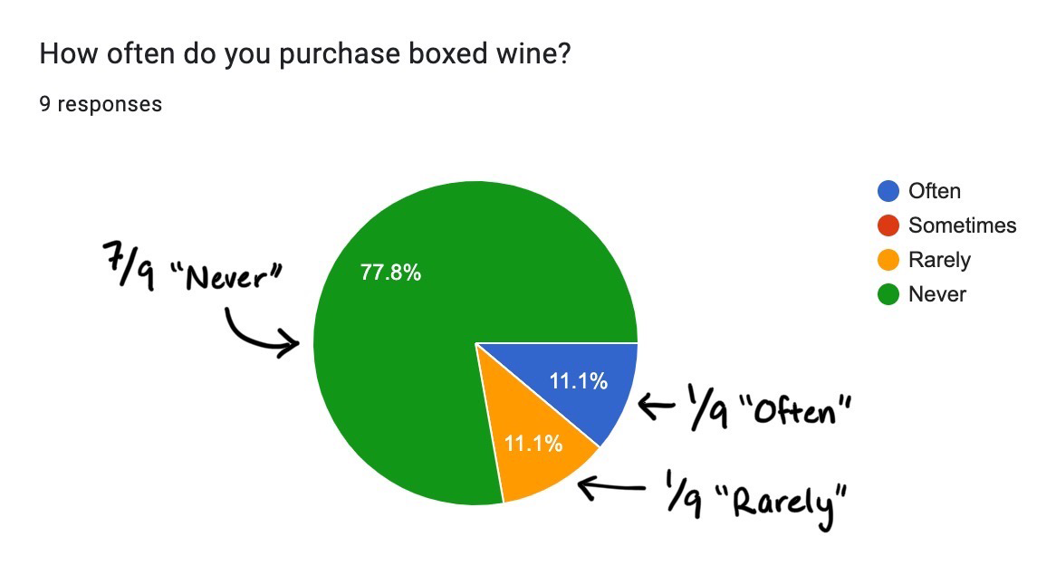
I started my primary research with the assumption that millennial-age wine drinkers prefer bottled wine to boxed wine. I put out a survey to find out if this was accurate. Sure enough, results showed that out of 9 participants (all wine-drinkers between the ages of 30 to 49 years old) 8 of them say that they never or rarely purchase boxed wine, and only 1 says they often do.
“I remember drinking Franzia in college. Back then, it was quantity over quality. Franzia is fruity and gives you a hangover. My taste has developed since then.” ~Millennial wine drinker, interview
Key Insights
After reviewing the survey results and interviewing 10 people, I discovered that wine drinkers in their 30’s to early 40’s tend not to buy boxed wine because:
People assume boxed wine is low quality
People are unaware of the advantages of boxed wine
People are just more used to bottled wine
Design Solutions
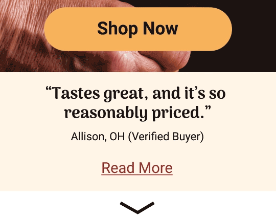
Solution #1: Review Carousel
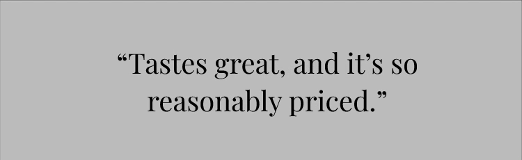
Reviews have been proven to be extremely effective in increasing conversion rates. I put a carousel of reviews on the homepage in order to generate trust in the product, and to challenge the assumption that boxed wine is automatically lower quality.
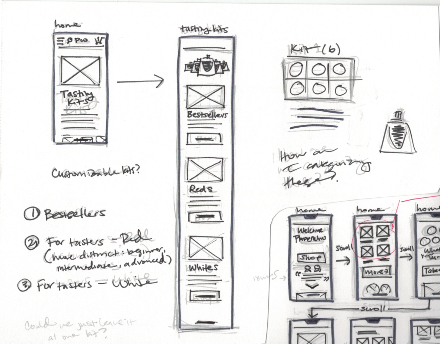
Solution #2: Tasting Kits
In the spirit of trust, I included a page that sold tasting kits so that people can sample products and receive a voucher for a full-sized boxed wine. It would communicate confidence in the brand and generate curiosity.
Solution #3: Winedentity Quiz
What I found most interesting about the user interviews were the different rituals around wine-drinking. While thinking of the best way to incorporate this concept, I included a quiz that categorizes different “types” of wine drinkers. It’s meant to be fun and memorable, but customers can also use it to help tune their wine recommendations. I also want it to open up more contexts for wine-drinking, and challenge assumptions about who and what wine-drinking is for.

Usability Testing: First Impressions
I tested a total of 6 participants. 3 of the tests were unmoderated, and 2 were moderated. All participants tested on a mobile prototype.

I was testing a prototype that was still in its early stages, and hadn’t built out any of the features described above, specifically the tasting kits page and the winedentity quiz. Instead, I included previews of those features on the homepage to get people’s first impressions and gauge their level of curiosity. I conducted this research with the aim of seeing what had potential and what didn’t work, rather than to test a fully functioning prototype.

A user flow map of my prototype.
Results: What Didn’t Work
1 - Not enough information on the homepage
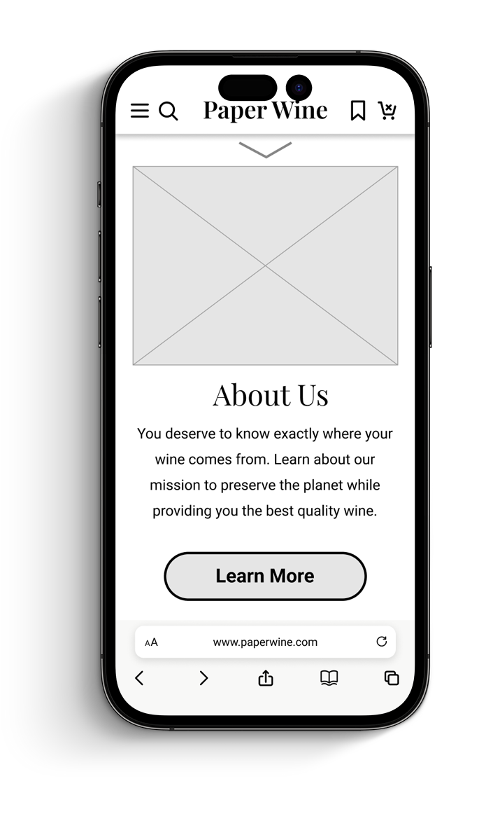
“I wish there was more information right off the bat rather than me having to click and be directed to another page.”
If it can be avoided, people shouldn’t have to click for essential information. I resolved this problem by designing a simple infographic to signal what kind of content to expect after tapping “Learn More”.

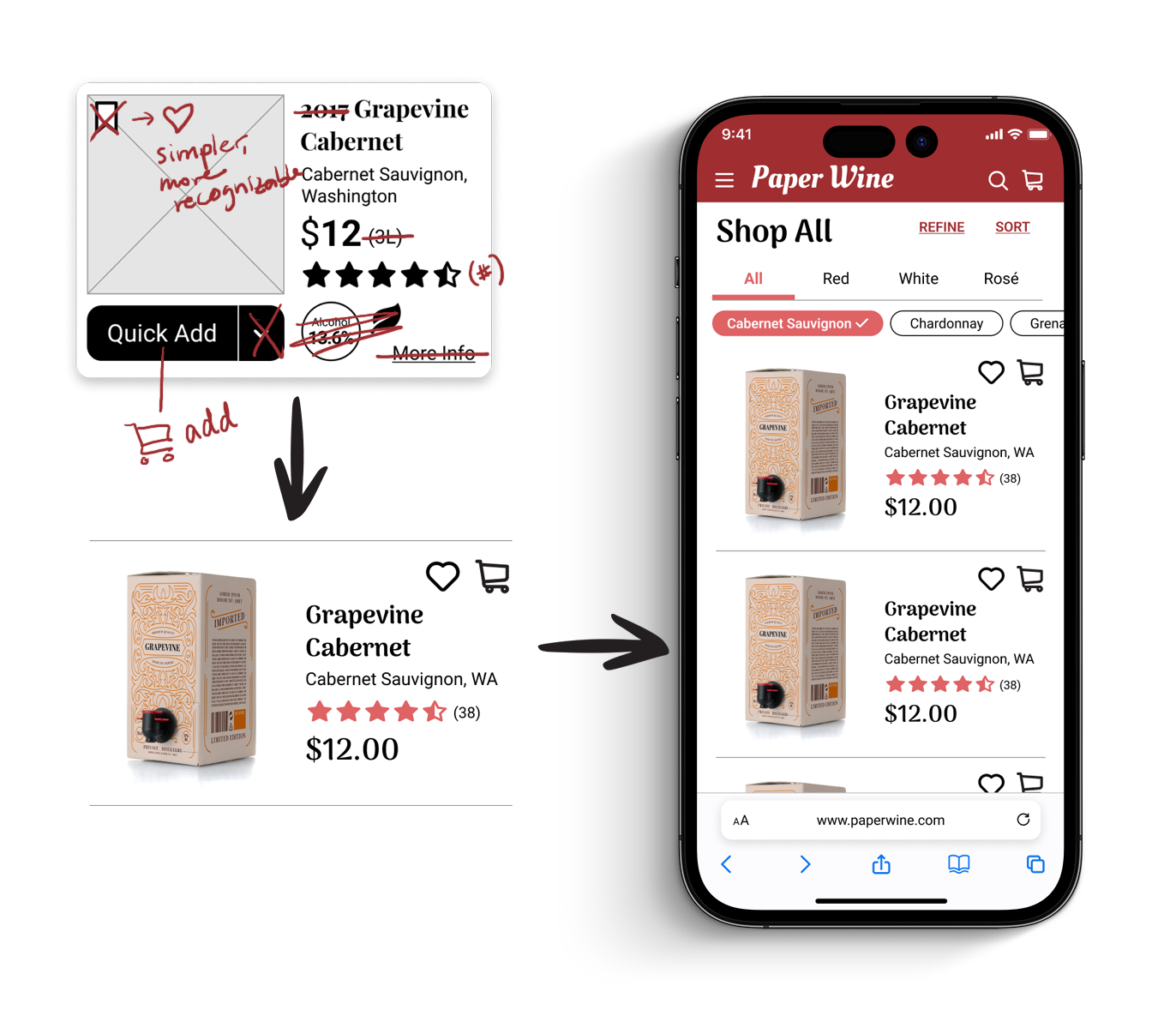
2 - Too much information on the item card
“It does feel a little bit crowded on each card.”
This feedback led me to ask myself: what information absolutely has to be in the preview card, and what can be revealed later in the product detail page?


Through a combination of competitive analysis, prior research, and common sense, I finally narrowed it down to:
Name & photo of product
CTAs (“add to favorites and “add to cart”)
Wine varietal/grape
Price
Rating
Results: What Worked
Review Carousel: Next Steps

“I see the reviews here, which is great…although it would help to know who is saying these things.”
Participants showed interest in the review carousel. In my next iteration I attributed a fake name to each of the review quotes, and found that it gave it a more authentic feel.

Tasting Kits: Next Steps

“I do think a tasting with friends would be fun. I would probably click that.”
The tasting kits also generated a lot of curiosity and interest. To take this further, I began to conceptualize what the tasting kits would contain and how I would design them.


Winedentity Quiz: Next Steps
I was personally most excited by how people responded to the quiz. It had been my most original idea, therefore the riskiest.
“I would definitely love to see what I am.”
From there, I began to think about what kinds of questions would be asked in the quiz, and I sketched out how the results page might look:


Reflection: It’s Not Just About the Product
At many stages, I had to stop thinking about ways to improve on a fictional product, and find the solutions in the actual design of the website. According to the usability tests, the ideas that focused on the website design rather than the product were the ones that worked.
I would even go further and say that it would have been a good idea to not expend any creativity on the actual products at all. I could do this by building a website selling existing brands of boxed wine. That may have forced me to focus only on the UX.